Shames me to say I've left the blog alone for waaaay too many months. As someone who used to update all work in progress here almost religiously, I can only say that as things got a bit hectic work and home wise over the last twelve months, certain regular habits definitely began to slip. Having finally got back on to an even keel, with the commercial work still coming in as a steady flow I'm able to pick things up again here.
The big change, after the woeful and shockingly poor treatment and service I've received from my 'current' agents over the last 18 months, has been discovering what an incredibly useful & lucrative tool Twitter can be, for bringing in a flow of regular satisfied clients and self-promotion generally. Not to mention the great community of creatives of all stripes and disciplines that I've had the privilege and luck to connect with and share process, practice and the general love for what we do.
So here is a bit of an info dump and a slice of what I've been up to over the last year, as a catch up exercise before I continue posting the latest & current works in progress. I'd still also recommend following us on Twitter in the meantime, as it's such an immediate way of display & response.
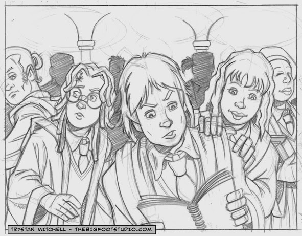
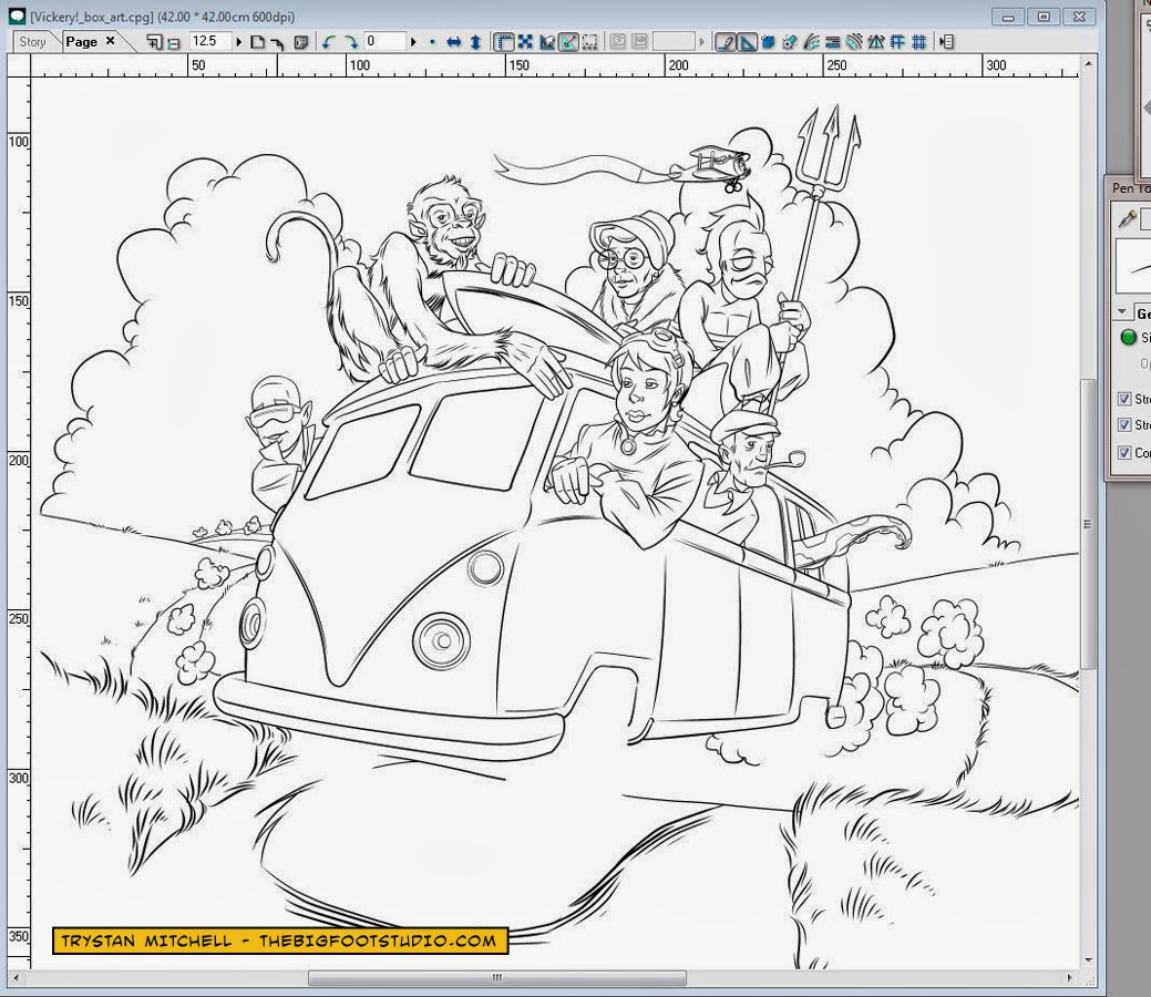
The observant out there will spot that I'm still draughting everything by hand in the first instance, but all inking and colour work is now exclusively Manga Studio. Been working with MSex4 for the last 12 months, but am just getting to grips with the vastly improved MSex5.
As ever, just click on any image for a larger view....
Mundo Jazz:
Big fan of these guys; they're so much more than the Spinal Tap of the 'World Music' scene. This was really a fan piece, but got a very favourable response from Juan and the guys in the band...
Lazy Jack's Kitchen, Fowey, Cornwall:
Was introduced to Michael Redmond, the proprietor of Lazy Jack's (@Lazyjacksfowey) through Twitter via my brother @Justintheframe . A refugee from London, Mick's a lovely bloke who claims to have had no formal design training at all, working in the past as a painter and decorator and in law enforcement. However he has a seriously good eye for design and a skill for matching all sorts of eclectic elements into really fun and pleasing environments.
Mick commisioned a new logo for Jack's and through swapping ideas and sketches back and forth I developed something of a retro dairy style logo for the coffee bar.
Brown Willy Chillies:
Who'd have thunk it... but you can grow chillies on the wilds of Bodmin Moor! As proved by John Batchelor and his business partner Rob. these guys bought up a chillie framer's stock of plants and tunnels up in Devon and transplanted the whole hydroponic operation to the top of Pensilva, just outside Liskeard in Cornwall. Another Twitter connection, @cornishchillies were great clients to work for on a logo commission; they didn't know what they wanted as a final item, but they had some really strong ideas of the kind of flavour, atmospheres and influences that they liked, and were swift and brilliantly responsive to the flow of ideas and saples I fired their way over a couple of weeks. We finally started to settle around the iconic Cheese Wring stone feature on the moor a couple of miles up the road when at almost the last moment I suddenly had the notion to slap a few stalks on the stones and colour them red....and hey presto, one rather distinctive and unique logo that very quickly became something of a conversation piece in its own right.
Phil "Bucky" Buchan:
Met Bucky via Twitter as @PMBuchan. A really engaging and talented writer & jack of all things wordsmithy, Bucky originally commissioned a two page 'adult' fairy tale for the pages of Starburst the movie, SF, computer gaming and comics magazine that he's worked for for a few years now. A great honour in itself as I was reading Starburst as a kid in the 1970s in its early pure film incarnation.
After that we teamed up on another of Bucky's scripts to pitch an idea to the still relatively but hugely succesful new weekly UK children's comic, The Phoenix, published by David Fickling Books

Bucky also does a nice line in seriously twisted and rather 'adult' morality tales, which appear under the banner of the small press comic Blackout, illustrated by a host of great artists like Philip Marsden
Japanese Schoolgirls on a Bus Vs Mechanessie:
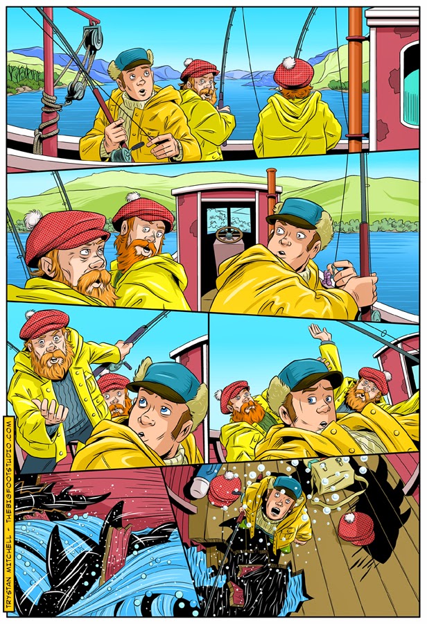
This was the big sadness of last year. A fantastic 28 page one shot all ages comic from Hellbound Media
The Green Frog Cafe, Bodmin, Cornwall:
John & Janet Lynch took over The Green Frog a couple of years back. A great place and welcoming friendly atmosphere. All sorts of home cooked food but I'm a particular fan of the cakes and John's excellent breakfasts. I did a portrait commission for them as atalking point in the cafe and worked up their new menu designs and layouts:
The Posh Pasty Co:
Did a bunch of speculative work for the TV chef James Strawbridge (son of Dick) and his Posh Pasty Co. during the summer. Came to nought in the end as a large bakery with an in house design team offered a deal for promotional graphics I couldn't compete with when they took on the production of his artisan pasties. But that's all part of being a one man band; without the resources of a large company and salaried design team you just take those moments on the chin, suck it up and eat porridge for a few days. But they were nice folk to meet and it was an interesting gig to work on for a while.

Dana Larsen's Hairy Pothead & The Marijuana Stone:
As ever the work on Dana's epic 12 part comic book adaptation of his own pastiche novel continues; I'm currently working on issue #4. I'm not a toker myself & the heady daze of any kind of drug fuelled youth are far behind in the mists of time, but this is a fun project to be working at on an ongoing basis. It pays the bills and has really helped me develop my style and work practice in the world of comics.
The Cornish Curry Co. :
Some more speculative work for a local food company who weren't 100% sure whether they where after a new logo, or a complete packaging redesign, and without any specific idea of elements or image they wanted to convey. So no pressure then! They did, however have a very strong idea of what they didn't want, having had speculative samples submitted from some larger design agencies, which was a way in to the job at least. I put a few ideas together to get the conversation started, but as their retail outlet seems to have now mysteriously vanished with no word from them, this is a design that will be sitting on the shelf a while longer. A shame, as I was quite pleased with the way it was shaping up, avoiding any of the obvious cliches of Indian cuisine that they'd had presented to them previously.
Quirkative Games:
These guys are dream clients and then some. A fledgling gameboard company run by two seriously game mad brothers, Scot & Elliot Symonds
As clients they were great to work for. They had very definite ideas of the look and feel of the product they wanted to realise, while being happy, even insistent that I put my own particular stamp and flare on the project. They were quick to respond with feedback to the various bits of work in progress, including the responses from the focus group of game testers they had in the background refining and fine tuning as they went. They were also happy to seek my counsel in areas where my expertise seemed to trump their own, and hugely supportive of my own small enterprise by promoting me to their business and social networks, providing me with further lucrative and enjoyable commissions from other companies around their home turf of Norwich. Not only that, but they would make a point of settling invoices within 24 -48 hours of receiving them, if not sooner! As I say, dream clients!


.JPG)
.JPG)
.JPG)
.JPG)
.JPG)
.JPG)


So much eye-candy for the eyes in one entry. Simply awesome art style. Love the old feeling I get over it. We have a famous illustrator here in Norway who has a very similar technique. If only I came up with his name... damn. Anyway, amazing work!
ReplyDeletehttp://www.theartofkaroline.blogspot.no/
Thank you very much for the kind words and the big up, Karoline. High praise indeed...your own work is beautiful. I'd be fascinated to learn the name of that illustrator when you dig his name out of the memory banks!
ReplyDelete